This document is worth a read because it provides an intelligent overview:
Key Figures on Climate France and Worldwide – 2013 Edition.
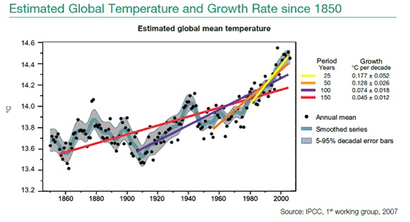
I enclose one graphic–for our global warming enthusiasts:
Note how the change in slope of mean global temperature is changing: from a slow increase,in red, to a more rapid temperature change, in yellow.
Give the document some of your time and then get your friends to read it. There are many good data points in the document.
