This document is worth a read because it provides an intelligent overview:
Key Figures on Climate France and Worldwide – 2013 Edition.
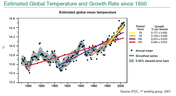
I enclose one graphic–for our global warming enthusiasts:
Note how the change in slope of mean global temperature is changing: from a slow increase,in red, to a more rapid temperature change, in yellow.
Give the document some of your time and then get your friends to read it. There are many good data points in the document.

Sorry, the comment form is closed at this time.